Accessibility refers to products, services, devices, buildings or vehicles being designed to ensure they are usable by as many people as possible.
It covers everything from ramps, lifts, and kneeling systems on bus entrances to subtitles and sign language on TV, allowing access to those with any form of access needs.
Accessibility is also essential to every type of content you create, from emails to blogs, social media content and print marketing.
You spend time fine-tuning your content to make it as appealing or click-worthy to your audience as possible, but how often do you take a step back and think about how accessible it is?
This could include things like:
- Are the words you use simple and to the point?
- Is the text really small on that PDF you designed?
- Do you have appropriate colour contrast on your social media images?
In this article, we explore the idea of accessibility in marketing, why it’s important and how to ensure your marketing material is accessible to your ENTIRE audience.
What is accessible marketing?
Prioritising accessibility means removing the barriers that may prevent someone from consuming your content.
It uses inclusive practices to allow each member of your audience to consume and engage with your brand.
Capterra found that 69% of marketers believe providing accessibility features is important to executing successful marketing campaigns.
Accessible marketing most directly helps older people and people with disabilities and impairments. It is estimated that 15% of the global population has some form of permanent disability and including those with temporary impairments drastically increases this number.
As well as increasing your reach, keeping your marketing accessible presents a positive image for your brand. Not only does it make it more user-friendly for people with certain disabilities or impairments, but it can make your content more engaging for everyone.
How to make your marketing more accessible
Marketing is the spine of your business – and your content marketing plays a crucial part in boosting brand awareness.
If you’re anything like us, you spend plenty of time putting yourself in your audience’s shoes and trying to solve their problems. That’s what your business is built upon!
But, when it comes to your content, empathising with your audience shouldn’t stop there.
Website accessibility
Your website is the foundation of your digital marketing strategy. It most probably features all the most important information about your business’s products or services, houses your blog posts offering valuable and useful content, and links to your social media profiles.
This makes it all the more important to have a website that prioritises accessibility.
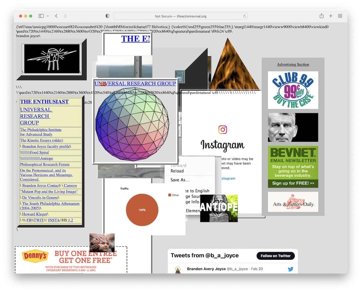
We’ve all visited websites that look like the digital equivalent of a nasty car crash, with text everywhere, random images and animations popping up and garish colours that make your eyes hurt.
Or perhaps a combination of all them – plus an awful navigation structure too, as in the image below:

If users find your website and are met with something visually jarring, overwhelming or unclear, the first thing they will do is click back off and go to the next search result.
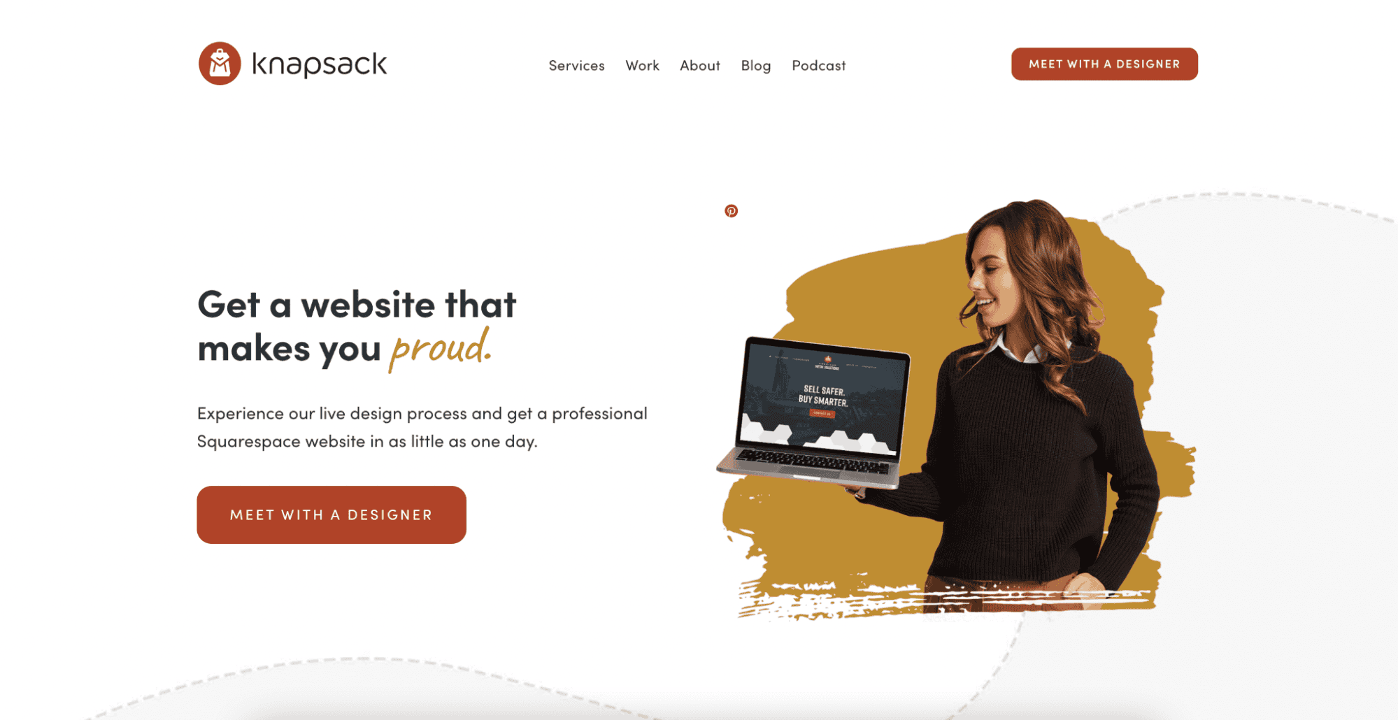
Instead, make sure you prioritise clarity and simplicity when designing your website – like in the example below.

Tim Berners-Lee, the inventor of the World Wide Web, once said:
“The power of the Web is in its universality. Access by everyone, regardless of disability, is an essential aspect.”
Accessibility Checks
You can make basic checks to test the accessibility of your website:
Pick a page and test how it looks on different web browsers, check how it appears on your smartphone and see if it is still readable if you resize the window.
The Web Content Accessibility Guidelines (WCAG 2.2) are the international standard for best practice when it comes to accessibility and are a useful point of reference.
There are also a number of add-ons and WordPress plug-ins that can make your website more accessible, such as:
It’s important to also consider that some people will not have a computer or may simply prefer to browse on their mobile phones. Sometimes, websites will look clear and easy to navigate on desktop, but will look totally different on mobile.
Most website builders will allow you to preview what your site will look like on a smartphone, so this is something we would always recommend.
Language and tone
Inclusive language and tone are key to keeping your marketing accessible. This means writing in a simple, clear way. We would recommend keeping sentences and paragraphs fairly short, using an active voice and using basic words rather than trying to impress.
While most website text will be written for an audience in a specific industry, it’s important to ensure jargon is kept to a minimum where possible, so as not to alienate other readers.
When you’re writing calls-to-action (CTAs), ensure it is clear where the consumer will be taken when they click. Avoid generic phrases like ‘click here’ and instead use words like ‘Find out more about this product’.
It could also be helpful to break up the structure with short bullet points, separate long quotes into smaller chunks and split up each topic with a new section or heading.
We would also recommend translating your website into other languages if your website attracts a global audience or are trying to enter a particular market. Of course, most browsers now have the ability to translate websites but Weglot claims that the accuracy of Google Translate is around 82.5%.
Weglot is a tool that allows you to translate your site into over 100 languages, so if you do have international website traffic, you’re not leaving out key demographics.
Of course, English is a global language and is spoken in every corner of the globe but translating your site to Mandarin and Spanish (both also widely spoken around the world), and you are extending your reach to places like China, Singapore, Spain and most of Central and South America.
Heading types
If you write blogs, PDFs or white papers, using headings is an easy way to make your content more accessible. Here we’re referring to ‘headings’ not in the literal sense of simply a title or subtitle, but in the way they are added to your website.
It’s more than just using a bigger text size. Headings also tell search engines what is most important on your website, so, if used well, will affect your search rankings too.
Most website builders will enable to you define what type of text you wish to use – often labelled as e.g. Header 1, Header 2 or H1, H2. The lower the number, the higher its importance should be.
Your headings should clearly describe the content that comes after it, making it easier for those scanning the article to understand its contents.
However, headings (when set up correctly) are also understood by screen readers and assistive technologies used by those with visual impairments. In fact, assistive technology, which helps those with visual impairments to consume written content, often jumps from heading to heading to allow the user to find the information they need.
Not only is it good for SEO, but headings provide clarity to your audience and build a cohesive structure for your articles or documents.
Fonts and typefaces
1,000s of fonts are available to us at the click of a mouse – but it doesn’t mean we have to use them all!
In all aspects of your digital marketing, use clear, consistent fonts and ensure all text is a reasonable size.
Some screen readers, which help visually impaired people consume content, do not make users aware of italic or bold formatting, so it’s important not to overuse these and find other ways to emphasise words, such as headings and punctuation.
Captions
If you produce any kind of video content, using captions is a simple yet crucial way to be more inclusive and, in the process, expand your audience.
Using tools such as Rev.com or VEED.IO, or video editing software like Descript, makes captioning simple.
Firstly, this makes your video content accessible to those with hearing impairments. But it also appeals to a wider portion of your audience, with a joint Verizon and Publicis Media study finding that up to 80% of viewers are more likely to finish a video with subtitles.
Digiday also found that 75% of people watch video content on their phones with the sound off, meaning that it’s important users can understand the content without it.
Images
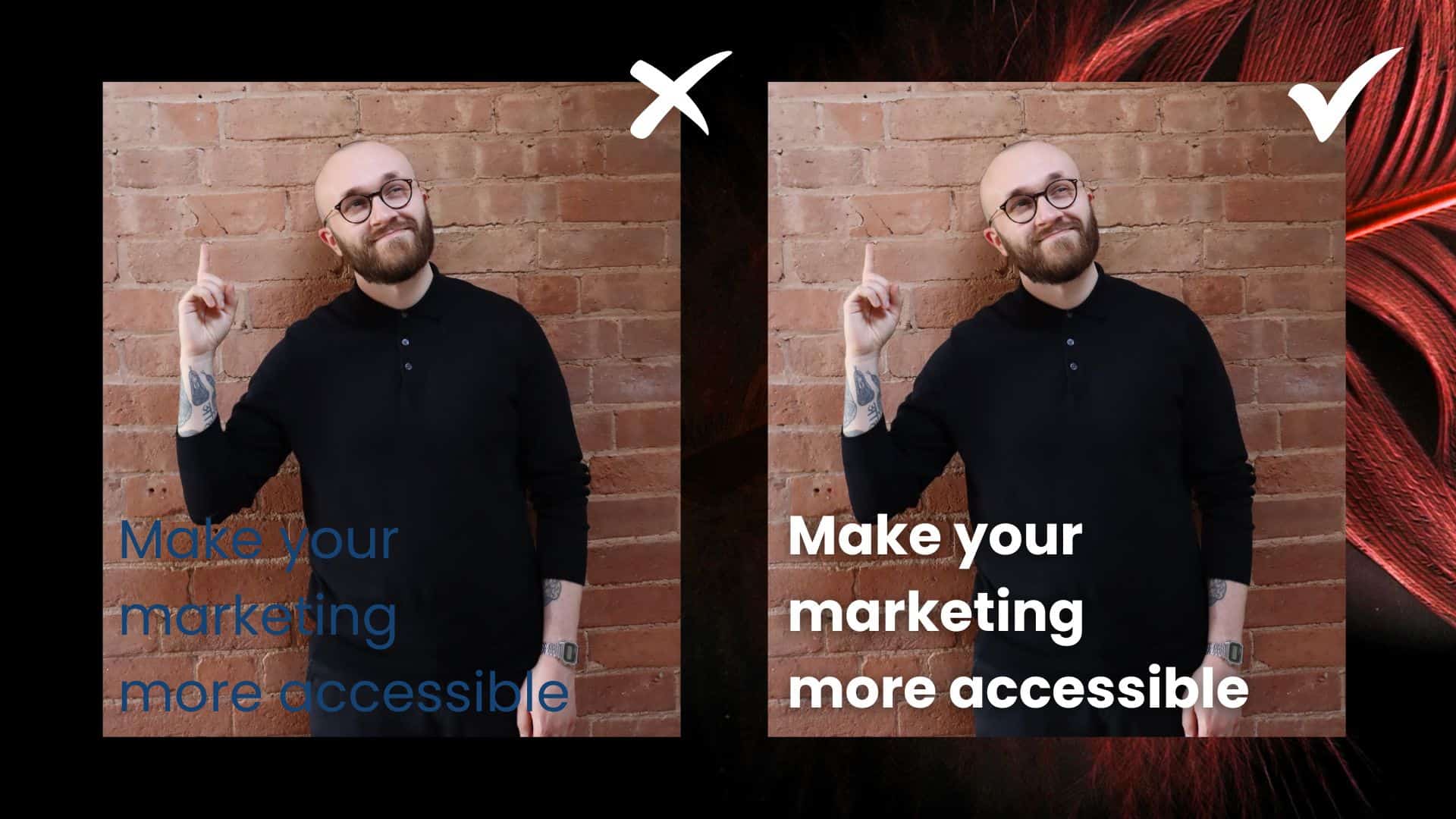
If you’re using text within images, ensure that it can be clearly read.

On the image here, the blue text doesn’t show up very well due to it being on a similarly dark background, whereas the bold white text, which also has a drop shadow behind to help ‘lift’ it from the photo behind, is much clearer.
When posting images to your website, always include text descriptions, or ‘Alt text’, so that screen readers can capture and process the information and those with visual impairments can fully understand your content.
Like with most other parts of marketing, simplicity is key when it comes to using images. Don’t overload your web pages with lots of graphics. Try to make sure there is a good balance of text and images.
If you do use an image that features complex information, graphs or statistics, try and reference them in any accompanying text too.
Colour contrast
We all love making our content colourful and creative but go too far and you could risk alienating a large portion of your audience.
Make sure that the contrast between text and images or coloured backgrounds is appropriate and that the text is legible.
You can check if there is enough contrast between colours in your marketing material with this free tool.
Emojis
We all love to use an emoji now and again, whether it’s in social media text or just on our messages to our loved ones.
But there is such a thing as ‘emoji overload’ (or at least we’ve just created the term).
Using too many emojis can detract from your message and make people lose focus. And from a business point of view, using too many could make you appear unprofessional.
While screen readers do provide detailed descriptions for emojis, using too many could still be confusing and frustrating to users.
Also, bear in mind that emoticons (representations of faces using text characters) do not get picked up by screen readers. So use an emoji such as 😀 instead of :-) if you want to add a little fun to your content.
Start with accessibility in mind
Prioritising accessibility in your digital marketing is not only a good moral choice; it could also help you grow your brand, increase your audience and win more business.
If you’re at the very beginning of your digital marketing process, pause for a second and consider how you will make your content accessible. Prioritising accessibility from the very beginning will mean that it becomes an integral part of your entire content marketing strategy, giving you a head start from the beginning by appealing to as much of your audience as possible.
If you feel like you need a little guidance, book a 60-minute strategy call with our MD, Emma.
